Here at k6.io, we like numbers! Our app is generating and collecting tons of numbers all the time, as part of running millions of load- and integration tests every month. Like many parents, we’re proud of what we’ve created and very interested in seeing how the popularity and usage of k6 is growing, and especially trying to predict how popular it is going to be in the future.
Github stars kind of indicate popularity, and as we're approaching christmas it seems like a good time to be looking at stars. Let's see if we can predict the future growth of the Github stars metric, using some advanced, chart-based analysis techniques I have invented.
These techniques require historical data to extrapolate from, and luckily a colleague recently showed me star-history.t9t.io - a nice little tool that gives you historical charts showing how many stars your Github repository had at various points in time.
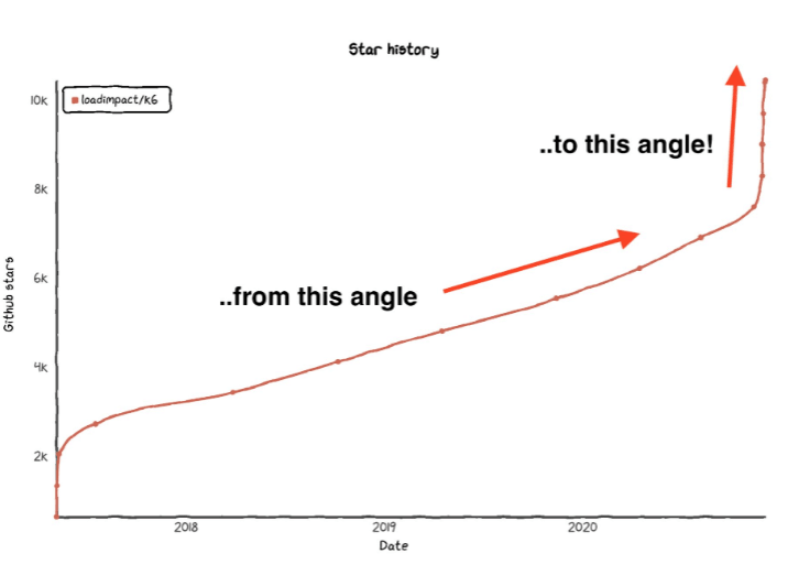
Let’s check out the chart for k6 and then try to determine where we’ll be a year from now. Here is the chart:
Looks pretty good to me! Growth seems to have been fast in the beginning, then slower, and now in late 2020 it has picked up again and grown by an amazing 2100 stars in just five days. I think there may have been some Hacker News article or something involved in both this latest growth spurt, and the one in 2017.
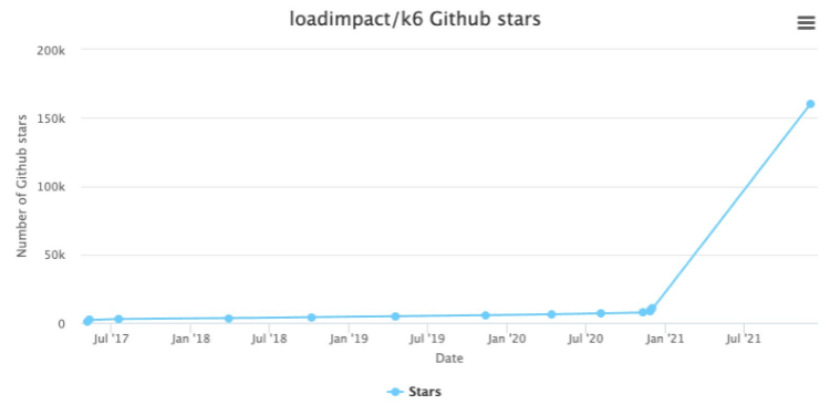
Of course, when extrapolating it is always best to use the latest data available, as old growth numbers just aren't as relevant. 2100 stars in 5 days equals 420 stars per day, which translates to about 150,000 stars in a year, or 1 million stars within 7 years. That means k6 will soon be the by far most popular software project on Github. Exciting!
star-history.t9t.io doesn’t have a prediction mode, unfortunately, so I’ll have to create my own chart to visualize my predictions. I’ll use Highcharts, because it was made in Norway, which used to be a swedish colony. So here is my simple prediction:
Aha, very informative. Some detail is lost in the period leading up to now, but that’s old news anyway.
-- But, you say, how can you be sure that this latest development will continue forever?
Very thoughtful objection! And the truth is we can’t, of course, but we can perhaps make a better prediction by looking at the change in the angle (derivative) of the curve!
Looking again at the first chart, we see that the angle has changed around 50 degrees over the course of 2 weeks:
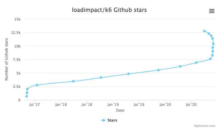
If that development continues, the next two weeks will be very interesting. Another 50 degrees of change, just like what we’ve seen recently, would cause the curve to flip over backwards! This would be an absolutely unique development, and probably make us an extremely interesting investment case for many VCs out there.
Here is a Highcharts visualisation of what might happen, and I have to say thanks to Highcharts for anticipating and supporting our rather unorthodox use-case (The norm is to have increasing time stamps in time series data, but they must have seen series like ours before, where later data have earlier time stamps. Perhaps it’s a common thing in Norway?)
Anyway, here is the chart:
But now I hear another objection coming... Isn’t it reasonable to assume that the growth per unit of time is going to decrease in the period 2018-2019, because that’s what it did last time?
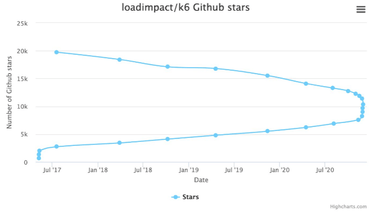
You’re right. We can’t expect the crazy fast growth to continue forever, so to be conservative with our predictions we should assume that growth is slower in the period ahead (?) of us. Something like this maybe:
So we would reach 20,000 stars sometime back in 2017 then. And another thing just struck me now - doesn’t this look suspiciously like the beginning of a sinus curve? I think we’re onto something big here.


